Album cover design for Sasu Ripatti’s (Vladislav Delay) 2022 ‘Speed Demon’ project. Ripatti has worked with, remixed, and produced albums Massive Attack, Towa Tei, Scissor Sisters, Craig Armstrong, Sly and Robbie, Black Dice, and Ryuichi Sakamoto.
Creative direction and design by Marc Hohmann.
Photography by Osamu Yokonami.
Global advertising campaign for the launch of Pax’s ERA ULTRA devices.
The campaign introduces three radical colorways and functional updates of the iconic ERA device and plays on customer personas’ eccentricities. Green, pink, and blue style cues are used in clothes, nails, makeup, hair and backgrounds with a diverse range of models casually engaged with the product. The result is an impactful and bold set of images used on billboards, web and instagram that immediately draw a viewer in.
Creative Direction: Marc Hohmann
Art Direction: Ned Hardy; Design: Abby Lowenstein ; Photography: Lindsay Ellary; Stylist: Jake Sammis; Hair & Makeup: Amy Galibut; Nails: Rachel Messik; Production: Hyperion LA
Logo, brand identity, and ad campaigns for the fashion designer Maria Cornejo
The dynamic ‘0’ symbol reflects Maria’s light flow of clothing and the brand’s visual style describes a mix of off-the-cuff improvisation and resolved polish.
Photographs by Mark Borthwick
Concept, creative and editorial direction
In opposition to fast content and hype, Days aims for the experience of an old school zine with a precision and relevance that is very much now. By combining parallels in art, philosophy, sustainability, and fashion, looking through Days is like walking through a passionately curated exhibition of timeless essentials.
The first issue includes an exclusive interview with the artist Alicia Escott, a feature on avant-garde composers’ notations, models from Nicola Kast’s cutting-edge casting agency, the wisdom of Robert Walser and more.
The second issue features exclusive interviews with NYC artist David Kramer, and Dutch fashion designer Camiel Fortgens, post-pandemic design innovations, Noh theatre, contemporary Mexican architecture and the cinema of female movie directors.
Available at Dayszine.com
The fastest train in America which carries more than 3 Million passengers started its service in 2000 with a symbol designed by Marc Hohmann. The fundamental design pillars are speed, elegance and a sense of lightness that stood entirely in contrast to the heavy, industrial look and feel of Amtrak and the railway sector in general.
Since its inauguration, the symbol has stood the test of time and is generally considered influential in transportation identity design.
Agency: O+CO/IDEO
Strategically, the package redesign of the Pax’s long-standing flagship devices is based on an overall move to shift the brand away from a tech-hardware positioning to a more lifestyle-oriented cannabis-flower brand. Visually, this means an overall more accessible and vibrant design language that is also reflected in the overall identity system of which these packages are the foundation.
The ERA line is accessible and fun - its design is bold, expressive, vibrant, and theme-based with the first theme being a ’Neon Ultra’ color story. The design focuses on a 'less is more' approach prioritizing sustainability over design complexities. An example of that is a universal tray that showcases the device on the package facade without using product photography which in return reduces printing and surface space.
2023-2024 cover artworks for the reissues of Vladislav Delay’s (Sasu Ripatti) legendary ‘Entain’, ‘Whistleblower’, and ‘Multila’ albums. Ripatti has worked with, remixed, and produced albums Massive Attack, Towa Tei, Scissor Sisters, Craig Armstrong, Sly and Robbie, Black Dice, and Ryuichi Sakamoto.
Creative direction and photography by Marc Hohmann.
As part of the London Design Festival, I co-curated the show “Like Me — Our Bond with Brands” at the London Design Museum in 2015. The purpose of the show was to promote Lippincott London as well as offer an entertaining yet profound glimpse into what constitutes a ‘brand’.
Rather than showcasing the portfolio of a branding firm, the show aims to blur the lines of an exhibition (art) and commercial values (brand) through the display of thought provoking pieces. It encourages visitors to ask: Who’s branding who? Would Jay Z’s songs still pack a punch without their brand-led lyrics? How much would you pay for a piece of George Clooney?
Agency: Lippincott
The Mini & PLUS line of these iconic Pax devices is set at a premium price point which translates into a more elegant expression (minimal, subtle typography, and carefully considered tone-on-tone colorways.) To reduce waste and in spirit of heightened sustainability, only the sleeve is bespoke while the rest of the package is a 'one size fits all' fully recyclable box construction. All structures are custom engineered and designed to reflect complex cannabis regulatory mandates such as child proofing, legal language requirements, etc.
Logo and identity designed by Marc Hohmann
Black+Decker is an iconic American brand. However, in 2013 its value was diminished based on over-licensing of product, a story about “power tools” in diverse categories such as cleaning and small domestic appliances.
The brand story was moved from one focused on power tools to a brand “around the home” for everyone on par with Volkswagen, Ikea or Uniqlo. The product line was drastically reduced to a focused offering that was unified throughout categories. The graphic expression changed to a simple logotype that can be universally applied without the need of a separate visual system.
Based on this revolutionary re-branding of B+D, the brand enjoyed a hugely successful rebirth in 2015 and has moved from bottom shelf to top shelf in weeks.
Agency: Lippincott
A collaboration book project by Akiko Tsuji with floral artists from around the globe showcasing arrangements by Studio Mondine, Meryl Valerie Floral Design, Seika Kodama, Twig & Twine, Greengardann, A.P. Bio, Louise Worner, Gem Fleuriste and Julia Dittberner Neuman.
Concept, creative and editorial direction
Highlights include exclusive interviews with designers Nicolas Andreas Taralis in Paris and Kostas Murkudis in Berlin. An in depth interview and feature with architect Richard Gluckman.
An exclusive cover story by acclaimed photographer and long time Raf Simons collaborator Bert Houbrechts plus photo stories by Viviane Sassen, Martien Mulder, Nicolas Wagner, Keetja Allard, Ken Dozono, Christophe Rihet, Kenshu Shintsubo and Martina Hoogland Ivanow. Fashion from Proenza Schouler, Christian Winjants, Dior Homme, Yohji Yamamoto and more.
Cover design for a 10” series of EP’s by the Finnish composer and producer Sasu Ripatti that showcase pieces of experimental dance floor music. All photography by Marc Hohmann taken in 2006 at the legendary Misshapes club in NYC.
Inventing a contemporary brand process
In today’s tech-enabled and social-media fueled world, the old rules of branding no longer apply. Large agencies are approaching challenges with a sequential methodology based on a separation of brand, product and experience. This makes them slow, disconnected and in need of broadcasting outwards rather than creating a mutual exchange between brand and consumer.
In the face of declining revenue and client trust, I created Panorama in 2016 to answer the need for a brand agency operating system that is based on the digital harmonics of our time. It is a tool that helps clients to make better, faster and more future-facing brand decisions.
Agency: Sterling Brands NYC
Gillette was facing significant sales declines on shelf at Target. Harry’s and Dollar Shave Club had not only disrupted Gillette’s marketshare through the online subscription model, but were commonly perceived as the better product.
Playing the competition’s game won’t be enough to reassert leadership. The Gillette story is about what the brand represented for 100 years: Performance. It is about matching the brand’s expression and experience to a superior product.
We need to ask: What does performance look like in today’s world?
Agency: Sterling Brands NYC
DAYS - Art Magazine
Concept, creative and editorial direction
In opposition to fast content and hype, Days aims for the experience of an old school zine with a precision and relevance that is very much now. By combining parallels in art, philosophy, sustainability, and fashion, looking through Days is like walking through a passionately curated exhibition of timeless essentials.
The fourth issue of Days features cover star, artist Daisy Collingridge; a chat with artist Max Geisler about the lure of destruction; an investigation into the science and poetry of rain and it highlights transcendent dream sequences in cinema. Other stories include rationalist architecture and contemporary thoughts on Nicolas Ghesquière’s Balenciaga, Theodor W. Adorno, and more.
Concept, creative and editorial direction
Highlights include exclusive interviews with Proper Gang and Supreme designer Max Vanderwoude Gross in NYC and the Brooklyn band Lemonade.
Photo stories by Mari Kojima, Joel Tettamanti, Nicole Bachman featuring UK design duo Mentsen, Naoki Ishizaka, Francesca Gardini, Mayumi Hosokura, Brent Chua, Kelsea Kosko, Akiko Tsuji and more. Artwork by Hoon Ju Ko. Text on design by Marc Hohmann and on NYC Ballet by Kyle Wukasch.
Luomo ‘Tessio’. Photography and direction by Marc Hohmann
Luomo ‘The Present Lover’. Photography and direction by Marc Hohmann
Gez Varley. ‘Bayou Paradis’
Vladislav Delay ‘Anima’. Photography and direction by Marc Hohmann
Vladislav Delay ‘Naima’. Photography and direction by Marc Hohmann
G-Man ‘Avanti’. Photography by Christophe Rihet
Andreas Tilliander ‘Ljud’
Akufen ‘My Way’. Photography and direction by Marc Hohmann
Graphics and messages supported the “Future of Work” theme with a backdrop of dramatic client images (NASA, GE, Coca-Cola, etc.) behind compelling messages about workflow, security, and more. The emphasis of this annual event was on Box’s value being defined by driving their customers success through work efficiencies powered by Box.
Role: Head of Brand
Under the leadership of Disney, the biggest Hollywood studios (Warner Brothers, Fox, Sony & Paramount) came together to build a movie platform that brings all movies together in one place, no matter where purchased, and make them available on a device. Can purchasing movies still be attractive in 2017 and beyond? If so, how?
Silicon Valley currently owns the streaming experience and each player approaches their experience the exact same way. Hollywood has the opportunity to expand people’s interest and build love for movies. If you love the experience and if you are confident in the source, then you’ll be more apt to buy.
Agency: Sterling Brands NYC
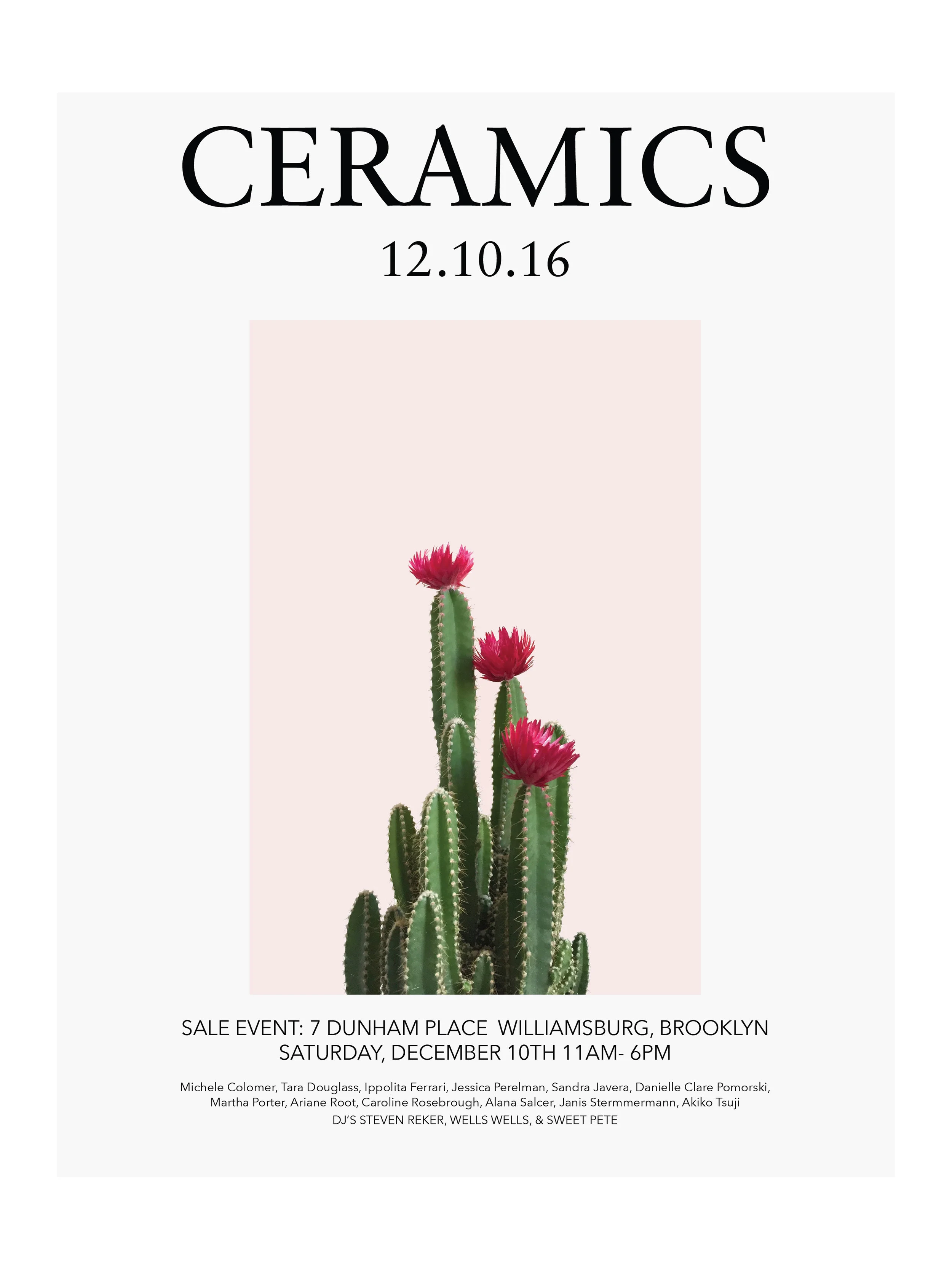
Posters photographed and designed for a ceramics pop-up shop in Brooklyn NY.
Branding a city is a highly sensitive affair. Love for a city means many different things to many people, and at the core is a sense of pride through past, present and future. Economically, the objective of London’s rebrand was to raise awareness on the heels of the 2012 Olympic Games, emotionally it needed to serve as an anchor for all Londoners.
The logo’s nomenclature “Est. 43 AD” places an image in your head rather and than relying on concrete graphic cues which are highly subjective. That image is different for everyone yet it immediately installs a sense of pride and belonging. Once applied on tourist merchandise and souvenirs it also provides a fun frame to quickly deliver a dose of British humor.
Agency: Saffron
Watch concepts and design
Role: Creative Director Swatch Lab NYC
Concept, creative and editorial direction
Highlights include interview with Bless, Koji Tatsuno in Paris, and Maria Cornejo in New York. Featuring Ban Shigeru, sound art and Le Maison Martin Margiela.
Photo stories by Naoki Ishizaka, Christophe Rihet, Marcelo Krasilcic, Chikashi Suzuki, Mark Borthwick and more.
Includes exclusive Mille Plateaux Various Artists CD
Ainnia Abu Dhabi
Logo and identity project for an expansive indoor ski resort located near the Jabal Hafeet mountain region on the border of the United Arab Emirates and Oman that features slopes, hotels, a golf course, shopping centers, and a residential village. The architectural project was developed by Cox Architects.
The vast scale of this project combined with the paradoxical idea of snow in the desert naturally provoked an audacious design solution of unique poetry. Here, exotic desert iconography meets the cool imagery of alpine symbolism in powerful and decadent minimalism: A white desert tiger greets a snowflake, a tropical fish swims in ice while a polar bear adores a solar eclipse.
Agency: Saffron
Identity system design
Logo and identity designed by Marc Hohmann
Stanley is a much loved, iconic American hand tools brand with a strong history of delivering innovation and reliability.
With the range of Stanley products expanding into healthcare and security, the brand needed to move away from its exclusively industrial position to a broader value proposition without losing fundamental brand belief.
With a new brand story and tagline “Performace in action” the Stanley brand was strategically and visually evolved to be more agile, dynamic and dimensional. Core equity elements such as the monotone yellow color pallette were carefully identified and elevated for maximum impact.
The Stanley brand evolution is generally considered one of the most successful in the industrial tools space and was exceptionally well received throughout.
Agency: Lippincott
Global brand campaign for PAX that showcases the product portfolio in unconventional use cases and diverse, unexpected customer segments.
Creative Direction: Marc Hohmann
Art Direction: Ned Hardy; Design: Abby Lowenstein; Photography: Davis Bates; Stylist: Jake Sammis; Nails: Rachel Messik; Production: Hyperion LA
In 2012, the City of New York was at the halfway point of its commitment to plant 1 Million Trees. With the intent to reach that goal as soon as possible, the city pushed forth with wide ad campaign designed by Marc Hohmann. This included TV and screen ads, banners, posters and signage. The double play of “I’M / 1M” allowed the message and visual to work as one singular entity.
Famous Aspect’s 20th anniversary issue entitled “Work” is conceptually referencing FA’s first “Organic Future” issue.
Featuring contributions from 25 artists and photographers – Osamu Yokonami, Brent Chua, Graham Holoch, Jessica Wu, Elena Tutatchikova, SO-IL, Francesca Gardini, Saskia Groneberg, Tom Callemin, Jonathan Frantini, Guy Yanai, Kelsea Kosko, Jun Tsunoda, Amy Li, Allegra Martin, Elsa Leydier, Bibi Yamamoto, Makiko Minowa, Mari Kojima, Bjarne Bare, Mike Spears, Hai Hsin Huang, Heather Sten and Jefre Cantu-Ledesma.
When Barneys New York was housed in the original, iconic Comme des Garcons New York flagship location on Greene Street in Soho we reimagined store completely. The aim was to create a disruptive, experience destination that balances the vitality of downtown NY with the original poised mid-town Barneys New York location.
The spaces are as much about art as they are about attitude, intent, culture and fashion - the less you see of any of all that the more desirable it all becomes…
Concept, creative and editorial direction
Highlights include exclusive interviews with Lui Nemeth, daughter of the iconic fashion designer Christopher Nemeth, SO-IL Architects, and Paloma Wool.
Photo stories by Brent Chua, Clarisse Canteloube, Amy Li, Kelsea Kosko, Heather Sten, Camila Falquez, Mari Kojima, Francesca Gardini, and Valentina Frugiuele. Poems by Lizzie Harris.
Identity refresh and creative direction for IndiGo, the largest airline in India by passengers carried and fleet size.
Most airlines are operationally driven and rely on transactional and digital imperatives to be attractive. They don’t care about the passenger more than filling a seat. Flying is an experience most people want to get away from.
The objective of this project was to re-introduce fundamental human qualities to air travel to reduce passenger stress and bring about the confidence to let go and surrender to the experience. How can we use contemporary digital, social and interactive design strategies to bring about immediate recognition, positivity and trust?
The solution: To guide the passenger through the complex air travel experience by focusing as much on 1:1 relationships as on mastering the total ecosystem of air travel itself (places, data and motion flows, distances, micro and macrocosms).
Passengers love YOU if they feel your CARE.
Design and promotion of the fashion designer Akiko Tsuji’s pop-up installation at the Voyager boutique in San Francisco.
A collection of modern poems written by Marc Hohmann between October 2018 and February 2019.
Logo and identity designed by Marc Hohmann
Since 1892 HMH has been a major US book publisher of novels and educational books that includes the Webster Dictionaries, Curious George and the J.R.R. Tolkien and Philip K. Dick catalogues.
As publishing was moving towards digital HMH needed to shed its traditional image and deduct their positioning to a more fundamental message: “Inspire curiosity”. In maintaining a logo of iconic status this meant replacing the romantic boy and dolphin symbol (the “journey”) with a more progressive and metaphysical mark (the “discovery”) as well as moving the web experience from mainly transactional to informational.
Agency: Lippincott
As part of HP’s 2024 brand evolution I was asked to conceptualize an external campaign that specifically targets top global talent. Answering to “Why would I chose HP as then next step in my career” it was important to speak in a verbal and visual tone that reflects the speaker and the audience equally.
A discreet organization by nature, HP is driving many impactful programs in research and advocacy that are generally unknown tom the public. The concept was to express them directly and creatively connect the brand to its products and internal programs in a more substantial, creative and credible way than ever.
Become interested in joining a vital team, in sharing true pioneering spirit or in feeding your curiosity by connecting ideas that access vast networks. All of those nerve points were the building blocks and design elements for this ground breaking recruiting movement.
Cover design for a 10” series of EP’s by the Finnish composer and producer Sasu Ripatti aka Vladislav Delay that showcase pieces of experimental ambient compositions.
Creative direction and design by Marc Hohmann.
Photography by Shinnosuke Yoshimori
Logo and identity design for the Denver based cyberdefense company Optiv that was formed out of a merger of the security firms Accuvant and FishNet Security. Since the logo design in 2016, Optiv has moved its headquarters into the newly constructed 1144 Fifteenth Tower in downtown Denver, one of the tallest skyscrapers in Denver built in the last three decades.
Agency: Lippincott
Alcon was seeks to maintain its #1 status in the space with the introduction of two revolutionary products: A lens you can continuously wear for a week and a monthly lens of unmatched comfort. How can we use these two products as a springboard for a new Alcon?
For many markets, vision brands focus only on communicating with eye care professionals. How do we better focus on the needs/wants of consumers? Vision care has become an assembly line from brand to doctor to patient. We needed to design an ecosystem that can create a conversation – and that means shifting Alcon to be consumer-centric by fully considering how their products fit into people’s lives.
Agency: Sterling Brands NYC
Logo, brand identity and website for a NYC fashion label
Logo and identity for fashion PR firm that represents Balenciaga, Victor & Rolf and Hussein Chalayan
Photography by Mark Borthwick
Two of the oldest and largest US landscaping companies merged in 2015 to form BrightView and with that making it the most prestigious and far reaching landscaping service provider in the nation. BrightViews clients include LACMA, The Bellagio, Four Seasons Hawaii, AT&T Park, Nasher Sculpture Garden and the MIT Campus.
The Identity is consciously simple and straight forward (a tree made of a ‘B’ and ‘V’ ligature) and the color blocked identity system is incredibly punchy. The blue trucks with the fresh green BrightView logo are easy to spot and are doing the heavy lifting in branding BrightViews work as it happens in the field.
Agency: Lippincott
Famous Aspect’s original project entitled “Organic Future”
Featuring contributions from Comme des Garcons, Philip Tracey, Philip Johnson, Chikashi Kasai, Ken Ishii, Arto Lindsay, Droog Design, Tony Oursler, Masa Sugatsuke and Masatomi Nakamura.
Origami poster construction in foil-stamped mailer
A collection of paintings by Marc Hohmann in black acrylic by a straw on white paper.
Identity, campaigns, store design and concept for EDITE, an avant-garde fashion boutique on Park Avenue NYC.
Campaign photographs by Marc Hohmann
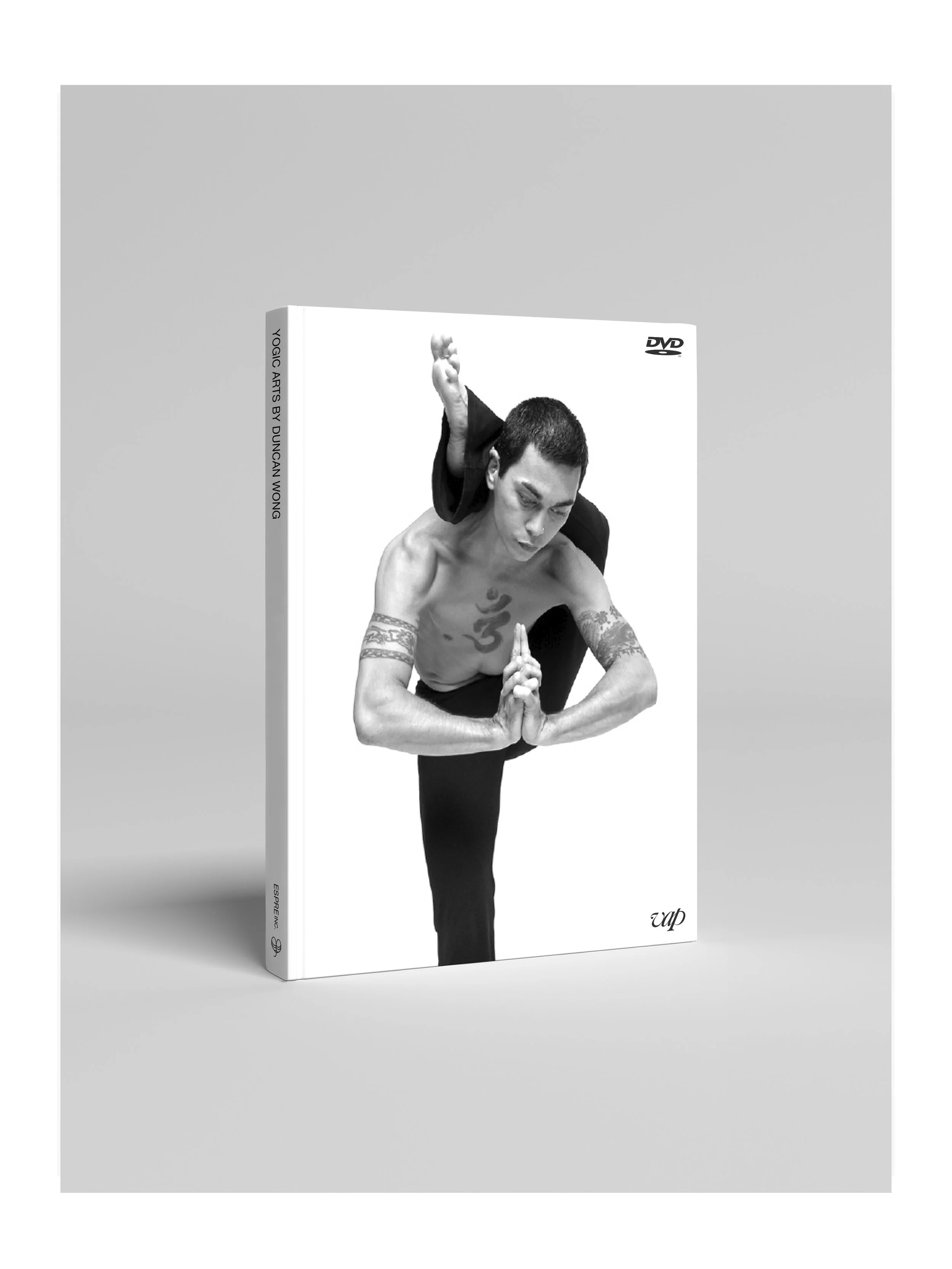
Book and DVD for Yoga master Duncan Wong for Espre Publishing Japan. Duncan is the instructor to Björk and Sting amongst many celebrity clients. The concept of the book was to place as much focus on the beauty and essence of form as on the instructional, step by step sequences of each Vinyasa.
Concept and photographs by Marc Hohmann
Logo, brand identity and website for a NYC fashion label
Box’s main challenge was generally low brand awareness and a convoluted brand story that left sales teams misaligned and customers confused. Often referred to as Dropbox for business, Box defined itself through its competitor without offering an ownable vision or perspective. This resulted in a lack of focused internal decisions followed by a peanut buttering of resources and activities rather than following a clear and actionable strategy.
In the last years, the brand has been going through a fundamental repositioning exercise. Namely, the shift from an IT-centric, product-to-people business model that was anchored around cloud storage via file, sync, and share in the workplace — to an enterprise-preferred, consultative, system-to-people model that focuses on providing management solutions and outcomes to larger business challenges.
Role: Head of Brand. Responsible for building and mentoring Box’s in house team and all brand output such as identity, web, video, guidelines, campaigns, events, etc
Talend is a world leader in data integration based in Silicon Valley. I was asked to help reposition the brand strategically and evolve its identity. Finding the core Talend story was imperative in order to establish a strong visual foundation and rid the brand of its confused and convoluted messaging and visuals.
In today’s world, data integration is not just about collecting and gathering information, but it is about having a single tool at the center of all business operations that allows maximized efficiencies of unthinkable speed, and provides an unmatched confidence in decision-making.
The Talend story is about being at the CENTER of all operations and about providing confidence of clarity through knowledge in an increasingly uncertain, chaotic world.
Visually, this is expressed through a rigorous commitment of the new circle logo to a central position on all assets. The no-frills logo itself is the ultimate core asset: A simple circle with elegant, timeless typography. The messaging was streamlined to highlight the product’s impressive outcomes in a direct ‘challenge vs. solution’ framework. The goal was to give form to the complexity of data input and to quickly communicate business advantage. The product (including the flagship product “Data Fabric”) connects to the brand story by ‘zooming’ deeper into the Talend promise and thereby unpacking features and suites.
Working as a consultant for the Evian/Danone Group and Euro RSCG I developed the key concept for Evian’s L’original campaigns for print, display and billboards.
The campaign started around the simple sketch gesture of putting an orchid into a bottle of Evian water as a vase. This lead to the idea of ‘Water and Beauty’ that is carried throughout the applications and images take take the concept further and further.
Agency: Euro RSCG
The objective was to create a “big idea” for GE Reveal lightbulbs that can inspire a campaign across multiple consumer touchpoints and to uphold Reveal’s position as a premium product offering in the GE portfolio.
The concept of “Reveal the full potential” speaks to having the right light and being able to do things better. The right light can elevate a bouquet of flowers to look like a painted masterpiece or its clarity can make you perform a mundane task like a profound act on a theatre stage. The poetry is the wonderment of dreams and aspirations that we discover within a moment while go about our lives. GE helps to reveal those moments.
Agency: Sterling Brands NYC
Book design and photography by Marc Hohmann
The Artist x Artist series brings together two creators from different fields with the aim to show a new or third expression. The first in the series combines Akiko Tsuji’s ceramic works with cookies from Anabel Lee’s Frolic & Detour Bakery.
Available at akikotsuji.com
Book design and photography by Marc Hohmann
A collaborative art project around dance, fashion, architecture and photography. The designer Akiko Tsuji created costumes for dancers which resemble free form sculptures without patterns that allowed them to move easily while creating sculptural drama through an organic, mutable blend of fabric and form.
Against the majestic backdrop of Herzog & de Meuron’s landmark building, we briefly join a journey of three clouds through Golden Gate Park as they take shape and flow in and out of form... Standing still and moving at the same time.